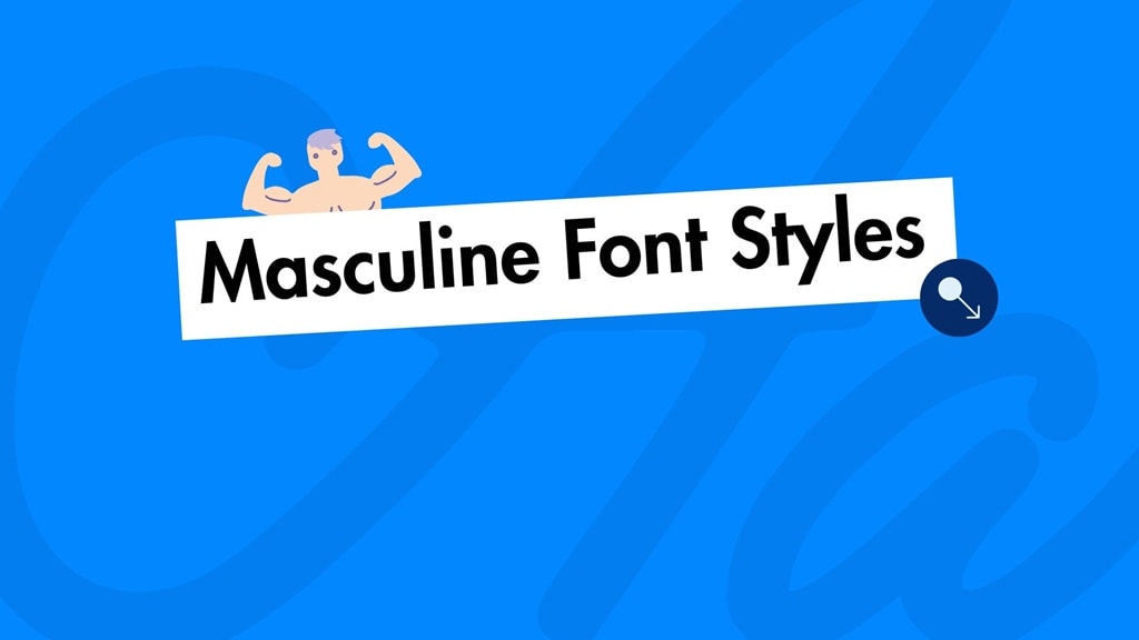
A masculine font doesn’t just speak—it booms. With bold strokes, sharp edges, and unapologetic weight, these typefaces radiate strength, confidence, and authority.
They’re not just letters; they’re a visual handshake that says, "Take me seriously".
But how do you harness that power for your brand?
What Defines a Masculine Font?
Masculine fonts are characterized by their ability to deliver power, durability, and strength.
While perceptions of masculinity in design are subjective and evolve with trends, certain typographic traits are commonly linked to this style:
- Bold and Heavy Weights: Thick, robust letterforms demand attention, conveying stability.
- Geometric or Angular Shapes: Sharp edges and clean lines create a structured, assertive look.
- Minimalist or Industrial Aesthetic: Utilitarian designs reflect a no-nonsense, mechanical influence.
- Serif or Sans-Serif Versatility: Sleek sans-serifs feel modern, while strong serifs with chiseled details add authority.
- Texture and Grit: Distressed or rugged finishes can suggest toughness.
These traits make such fonts ideal for logos, posters, packaging, or websites aiming to project confidence and authority.
Why Use Masculine Fonts?
Masculine fonts are a strategic choice for designers and brands aiming to make a powerful impression. Here’s why they work so well:
- Brand Identity: Businesses targeting male audiences or emphasizing strength (e.g., automotive, fitness, or outdoor brands) can reinforce their values with these fonts.
- Visual Impact: Their commanding presence ensures text stands out in headlines, logos, or ads.
- Versatility: They perform well across digital and print media without losing their edge.
- Emotional Connection: These fonts tap into emotions like confidence and reliability, resonating subconsciously with viewers.
Top Masculine Fonts for Your Projects
To help you find the perfect masculine font, here’s a curated list of some of the best options available, along with their key characteristics and ideal use cases:
1. Bebas Neue
Its ultra-bold weight and tight spacing exude strength and intensity.
- Style: Condensed Sans-Serif
- Characteristics: Tall, narrow, and bold, Bebas Neue is a go-to for designers seeking a commanding yet modern look. Its condensed form makes it ideal for headlines and logos.
- Use Cases: Movie posters, sports branding, and magazine covers.
2. Impact
Its heavy stroke weight and straightforward design convey authority and directness.
- Style: Sans-Serif
- Characteristics: Thick, compressed, and highly legible, Impact lives up to its name by delivering a punchy, no-frills aesthetic.
- Use Cases: Social media graphics, product packaging, and promotional banners.
3. Anton
The font’s geometric structure and bold weight give it a rugged, dependable feel.
- Style: Sans-Serif
- Characteristics: Anton is a bold, condensed font with a slightly retro vibe. Its clean lines and strong presence make it versatile for modern designs.
- Use Cases: Website headers, apparel branding, and advertising campaigns.
4. Rockwell
Its chiseled, monolithic letterforms are pure strength and timelessness.
- Style: Slab Serif
- Characteristics: Rockwell’s blocky, geometric serifs and heavy weight create a sturdy, grounded appearance. It’s both classic and commanding.
- Use Cases: Editorial design, logos, and signage.
5. Rust
The distressed texture and bold forms scream durability and authenticity.
- Style: Distressed Display
- Characteristics: Rust is a textured, gritty font that feels raw and rugged, perfect for projects needing a weathered, tough vibe.
- Use Cases: Vintage logos, outdoor branding, and artisanal product labels.
6. Futura
Its geometric precision and confident simplicity align with modern masculinity.
- Style: Geometric Sans-Serif
- Characteristics: Futura’s clean, circular letterforms and modernist aesthetic give it a sleek yet authoritative edge.
- Use Cases: Tech branding, luxury goods, and minimalist designs.
7. Montserrat
Its strong, balanced structure conveys confidence and reliability.
- Style: Sans-Serif
- Characteristics: Montserrat combines clean, geometric shapes with a bold, modern feel, offering a versatile yet assertive look.
- Use Cases: Corporate branding, website typography, and product labels.
8. Gotham
Its sturdy, no-nonsense letterforms project strength and professionalism.
- Style: Sans-Serif
- Characteristics: Gotham’s sleek, bold design and geometric clarity make it a timeless choice for authoritative typography.
- Use Cases: Advertising, logos, and editorial headers.
9. DIN Next Pro
Its utilitarian design and sharp edges are built durability and precision.
- Style: Sans-Serif
- Characteristics: DIN Next Pro is an industrial-inspired font with clean, angular lines and a mechanical aesthetic.
- Use Cases: Tech startups, automotive branding, and signage.
10. Trade Gothic
Its robust, functional design radiates strength and dependability.
- Style: Sans-Serif
- Characteristics: Trade Gothic is a bold, condensed font with a straightforward, workmanlike quality.
- Use Cases: Newspaper headlines, posters, and brand identities.
11. Knockout
Its heavy weight and dynamic energy scream power and intensity.
- Style: Sans-Serif
- Characteristics: Knockout is a bold, condensed font with a sporty, aggressive vibe, perfect for high-energy designs.
- Use Cases: Athletic apparel, event posters, and fitness branding.
12. Stencil
Its utilitarian, tough appearance aligns with themes of strength and resilience.
- Style: Display
- Characteristics: Stencil features bold, cut-out letterforms with a rugged, military-inspired aesthetic.
- Use Cases: Packaging, logos, and outdoor signage.
How to Choose the Right Masculine Font
Selecting the perfect masculine font depends on your project’s goals, audience, and medium. Here are some tips to guide your decision:
- Define Your Brand’s Personality: Is your brand rugged and outdoorsy, or sleek and modern? Choose a font that aligns with these traits. For example, Rust suits a vintage, gritty vibe, while Futura fits a polished, contemporary look.
- Consider Readability: While bold fonts are eye-catching, ensure they remain legible, especially for body text or smaller sizes.
- Pair Wisely: These fonts often work best as headlines or accents. Pair them with neutral, readable choices(e.g., Helvetica or Open Sans) for body text to maintain balance.
- Test Across Mediums: A font that looks great on a website might not translate well to print. Test your chosen font in various contexts to ensure consistency.
- Match the Audience: Consider your target demographic. Younger demographics may prefer edgy, distressed styles, while older audiences often favor timeless serifs.
Modern Masculine Typography Trends
As design preferences shift, masculine fonts are finding new expressions. Key movements gaining traction include:
- Retro Revival: Fonts with a vintage or industrial feel, like distressed or slab serif styles, are making a comeback, especially in branding for craft products and lifestyle brands.
- Bold Minimalism: Clean, geometric sans-serifs with ultra-bold weights are gaining popularity for their ability to blend modern simplicity with masculine strength.
- Custom Lettering: Brands are increasingly opting for custom masculine fonts to stand out, combining rugged textures with unique flourishes.
- Monochrome Pairings: Designers are pairing masculine fonts with monochromatic color schemes to create sleek, high-contrast designs.
Conclusion
Let’s cut to the chase—masculine fonts don’t whisper. They declare. Sharp edges, heavyweight presence, and unshakable confidence baked into every curve and angle. This isn’t just typography—it’s attitude in ink (or pixels).
But here’s the real win: A masculine font does more than look tough—it makes your brand feel undeniable. Whether it’s a logo that demands a second glance, a website that oozes authority, or packaging that stands out on crowded shelves, the right typeface turns "meh" into "hell yes".
So quit scrolling. Pick a masculine font that packs a punch, and let your designs do the talking. Time to make your typography as unignorable as your ambition.


